Published by Steve Litchfield at 6:30 UTC, September 18th 2015
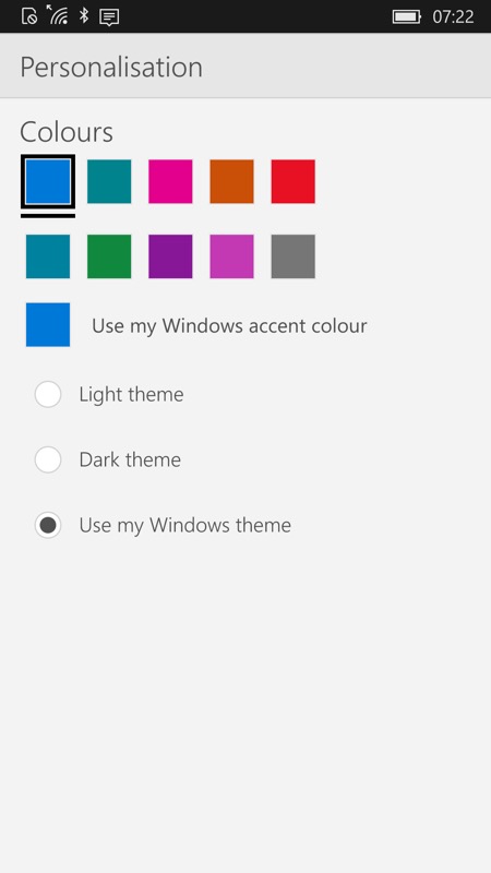
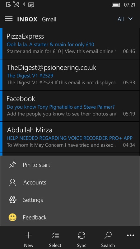
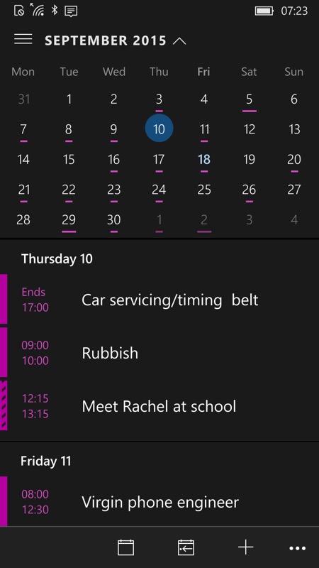
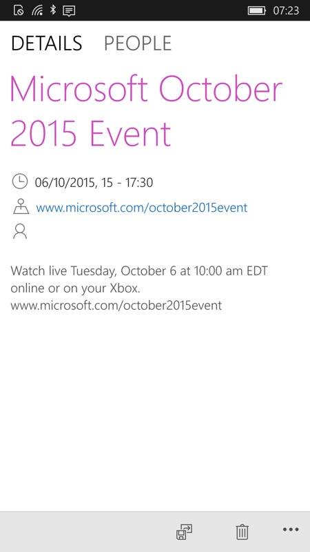
Microsoft has updated the Outlook Mail and Calendar applications for Windows 10 Mobile with some support for a Dark theme on Windows 10 Mobile. There’s the option to force this on or follow the wider device interface theme, though note that not all screens obey the rules just yet! In particular, reading an email or viewing an appointment will still err…. blind you at night. Ahem.
The changelog for the two apps is:
- Choice of light theme, dark theme and following the accent colour chosen by the user in .
- Removed the option to toggle over to Outlook Calendar (the corresponding button had already gone from Calendar in a previous version, I’m guessing no one actually used these – it’s much more intuitive to access the applications from the Start screen, etc.)
- Access to Settings button is now from the bottom ‘…’ bar.menu.
Here are the two applications in action:


Plenty of customisation then, in Outlook Mail, though once you actually READ an email, you’re back to eye-glaring white, thanks to the HTML/web nature. Maybe an extra option to try rendering these darkly too, Microsoft? Otherwise half the benefit of going dark in the first place is kinda lost….??!


Ditto for Calendar – and unforgiveably so – there’s no reason at all why Calendar appointments have to be ‘rendered’ in white still!
So, Microsoft, a step in the right direction, but please go the extra mile and finish the job!