There definitely comes a point where interfaces become too complicated for their own good, you know. How many Macbook owners actually remember what all the various trackpad and magic mouse gestures are/do? What about keyboard shortcuts in any given application or OS on any computer – who really remembers more than a handful? And now that the wider world has gotten used to touch and ‘long pressing’ in a touch environment (for example, on Windows Phone), Apple and Huawei (with its Mate S) want the world to jump into a new world where there are slightly harder presses, and then even harder presses, to action new functions in an interface. What could possibly go wrong?
In case you’ve been living under a rock this week, here’s Apple’s glossy intro to 3D Touch (their version of Force Touch tech):
Now, I have some previous experience in the smartphone world in general and touch specifically. I was around back in the days of the very first touchscreens, on the Palm Pilot PDAs, heck I even wrote a magazine dedicated to them, around 16 years ago. These screens were ‘resistive’ and you tapped on them through a slightly squidgy layer of plastic, i.e. you had to apply a little pressure (usually with a stylus, though a fingernail also worked) – and this system persisted until about 2009 on various platforms, especially on budget handhelds.
However, capacitive screens were a big innovation in the late 2000s, starting with the Apple iPhone in terms of mass acceptance, of course. The technology had been around before, but was cost prohibitive to put into a mere ‘phone’. Apple managed to shoehorn it in and charged customers by virtue of the iPhone’s premium price. But it took until 2010 before capacitive screens were cheap enough to really spread across the phone world, at all price points.
Capacitive touchscreens were hailed (and rightly so) because you didn’t need to apply any pressure – the user experience was superb, your fingertips literally gliding over an smooth oleophobic surface. All of a sudden we weren’t restricted to taps, we could now use gestures – and new operating systems and interfaces grew up to make full use of this, with OS like Meego and Sailfish being almost entirely gesture-based.
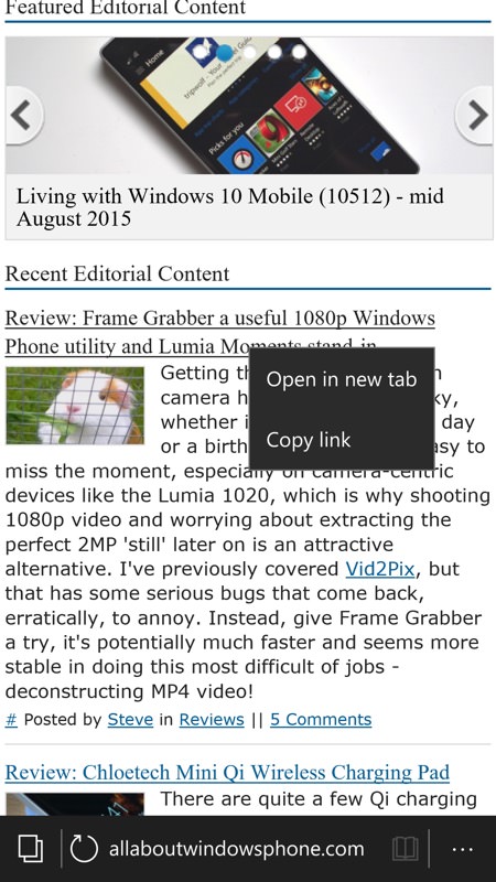
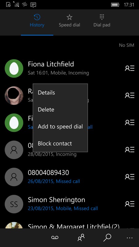
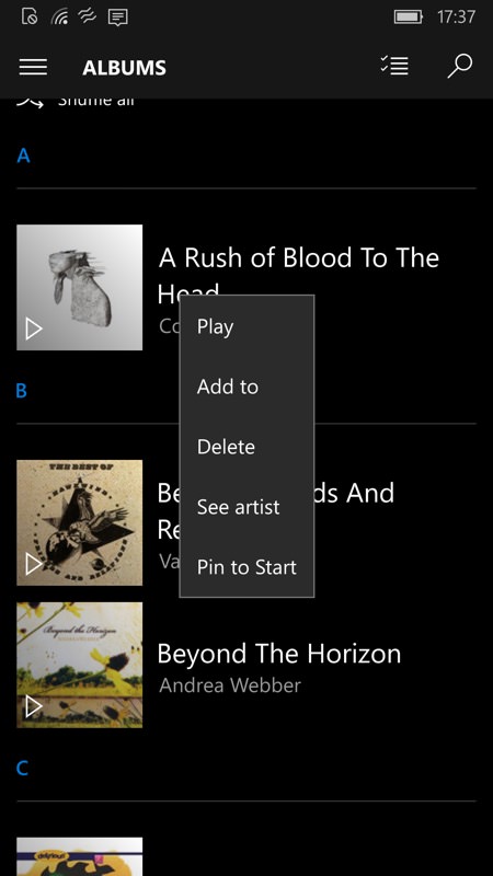
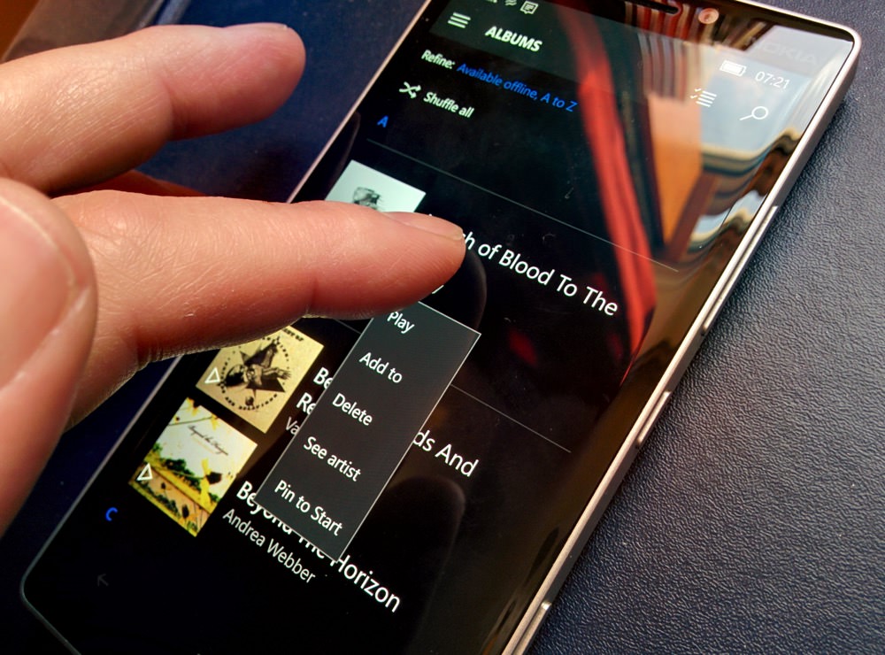
But. What about wanting to do context-sensitive actions, the equivalent of right-clicking on something on a desktop or laptop? There are plenty of situations where you want to see what your options are to do with whatever you’re pointing at, on-screen. Happily, this has been solved in the last five years, with long-pressing on something nearly always producing sensible follow-up actions. Here, for example, are some common ‘long press’ pop-up menus in Windows 10 Mobile:


All this makes absolute sense – your finger is on a smooth pane of glass, you’ve mastered taps and swipes – leaving your finger lingering in a spot (e.g. on an entry or icon) is a logical way to ask for something else – i.e. ‘right click’ stuff. Especially on Windows, of course, which has had ‘two button’ mice since almost the beginning over on the desktop.
Apple’s problem is that its iOS user interface didn’t have any concept of long pressing to do anything – to get more information or functions you always have to tap through to a new screen. The logical thing to do would have been for Apple to have implemented a long press/tap in the same way as Windows Phone/Windows 10 Mobile, but unfortunately it has gone down the road of using ‘force’ instead.
So having established that no pressure was required on capacitive touchscreens, we now have a situation where Apple (and some Android manufacturers) are starting to require pressure after all. “Press harder”, “Press very hard and for longer”, and so on. And while I agree the glossy demos look impressive, it requires:
- expensive display technology and a whole new phone for many people
- a decent level of dexterity on behalf of the user
The first is obvious, since Apple and Huawei want to sell more new phones. Why implement long-press (or similar) on existing touchscreens that users already own when something sexier could be dreamt up which would generate millions more new handsets sales?
The second is both interesting and relevant though. I noted Stefan and James chatting about this on this week’s Voicemail, imagining a conversation over the phone, talking your mum or dad into doing something basic on their smartphone. Along the lines of (and I’m paraphrasing their example):
(you) “Press the icon”
(parent) “I did, but extra things appeared!”
“Oh, you were pressing too hard. Try again, hardly touch it.”
“Now it’s not doing anything.”
“That’s because you didn’t touch it properly! Try again, but just enough pressure to make it work.”
“Now the things were back again, but they vanished and then I’m in a different screen.”
“Ah, this time you pressed the screen too hard and for too long!”
And so on. A dextrous youngster would have no problem grasping such a 3D/Force Touch interface, of course, helped by Apple’s work in haptic feedback for all this. James did make the point that this was a generational thing and that everyone would ‘get used to it’ in time, but it’s going to be a disaster for some normal users, especially of an older generation.
My own dad, famously, couldn’t even use the original 10″ iPad – his more elderly fingers were trembling just enough that they kept activating unwanted things on the capacitive touch screen. For him, a resistive-screened iPad would have been perfect, with everything requiring a firm press to do anything at all. Introducing capacitive and then Force Touch is several leaps beyond what his mind and fingers are capable of using. Many ‘normobs’ will be some way between the dextrous youngster and the elderly example, of course, and it’ll be interesting to see comments from anyone other than reviewers and geeks in time.

In contrast, hooking extra context-sensitive functions off a ‘long press’ on a spot is simpler to implement and simpler for a user to do in a reliable fashion. I do appreciate that Apple’s UI vision for ‘3D Touch’ goes further than ‘right-click’-style options (as seen on the more ‘PC-like’ Windows Phone and Windows 10 Mobile), of course – the ‘peek’ and ‘pop’ ideas are very cleverly conceived and demonstrated.
Will all this matter in the long run? Possibly not – once a phone buyer gets used to the way things work on the phone they’ve spent their hard earned money on, no doubt most people will be fine, whether it’s long press (i.e. based on time on a spot) for a pop-up menu or ‘3D Touch’ (based on pressure) to get the same thing (and more). It’s just that the latter does seem a little like a sledgehammer to crack a nut. (An appropriate analogy given the subject matter!)